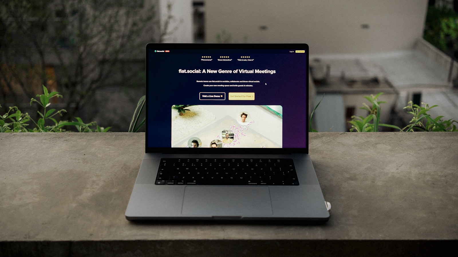
A website layout is not merely an aesthetic choice; it is a meticulously engineered map designed to guide a visitor from discovery to transaction. In the digital economy, a beautiful website that doesn’t convert is simply expensive art. A successful high-conversion website layout design is built on the principles of user psychology, visual hierarchy, and seamless flow, ensuring every element serves the singular purpose of driving action—whether that action is a sale, a lead, or a booking.
The goal of conversion layout is to eliminate friction, answer the user’s core questions immediately, and make the Call-to-Action (CTA) the most logical and visually obvious next step. Every pixel, line of text, and empty space must contribute to this conversion journey.
Mastering conversion-focused design principles is the key to maximizing the Return on Investment (ROI) from all your traffic sources, including SEO and PPC campaigns.
At Popnest Media, our expertise lies in Conversion-Focused Website Design, ensuring the layout and flow of your site are strategically optimized to transform passive visitors into active customers.
I. The Psychology of Layout (Guiding the Eye)
Effective design leverages inherent human reading patterns to control focus and direct attention toward the conversion goal.
1. The F-Pattern and Z-Pattern
These patterns describe how users scan web pages before committing to reading.
- F-Pattern (Content-Heavy Pages): Users scan the top horizontal bar (header), then move down the left side, occasionally reading across (creating an F-shape). Layout Implication: Place your primary value proposition and CTA along the top and left margins.
- Z-Pattern (Sparse Pages/Landing Pages): Users look across the top (1), then diagonally down (2), then across the bottom (3). Layout Implication: Place the logo (start) and the main CTA (end) at the diagonal endpoints for maximum impact.
2. Visual Hierarchy and Color Contrast
Hierarchy uses visual weight (size, contrast, color) to signal importance.
- The Primary CTA: Must use a high-contrast color (the “accent color”) that is reserved only for primary action buttons. The CTA should be the largest, most vibrant element in its immediate vicinity.
- The Power of Whitespace: Negative space (empty areas) is crucial. Surrounding a CTA or a key headline with ample whitespace draws the eye and prevents visual clutter from diminishing focus.
3. Directional Cues
Subtly guide the user’s eye toward the CTA using visual pathways.
- Explicit Cues: Arrows, lines, or paths that literally point toward the button.
- Implicit Cues: Using high-quality hero imagery or Video Production assets where the subject’s gaze is directed toward the sign-up form or CTA button, a highly effective psychological technique.
II. Anatomy of the Homepage: Above the Fold
The area visible before scrolling is the most valuable real estate on your site. The layout here must sell your value proposition instantly.
1. The Immediate Value Proposition (The Hook)
- H1 Headline: Must be clear, benefit-driven, and answer the question: “What do you do for me?” It should be the first element the user reads.
- Subheadline: Provides context and answers the “How?” or “Why now?”
- Placement: The H1 should be centered or left-aligned, dominating the top half of the screen.
2. The Primary Call-to-Action (CTA)
The first, most critical conversion element.
- Placement: Often positioned directly beneath the Value Proposition or in the top-right corner of the screen (following the Z-pattern).
- The Sticky CTA: The conversion button (e.g., “Get a Quote,” “Start Free Trial”) should remain static and visible (sticky) in the header or footer, even as the user scrolls, especially on mobile.
3. Supporting Visuals (The Hero Section)
The hero image or video loop should support the value proposition without overwhelming the page speed.
- Relevance: The visual must clearly represent the service or outcome you provide. Generic stock photography decreases trust.
- Video Integration: A short, high-quality, muted background video (Video Production) demonstrating the product or service in action can significantly boost engagement and conversion rates.
III. The Conversion Flow: Designing the Scroll
The rest of the page layout must anticipate and overcome customer objections in a logical sequence.
1. Social Proof Section (Building Immediate Trust)
Immediately below the fold, layout elements must establish credibility before asking the user to invest time or money.
- Trust Bar: A horizontal bar showcasing logos of key clients, major publications, or security seals.
- Testimonials/Ratings: Use a carousel or blockquotes for short, powerful customer testimonials, ideally with star ratings visible (critical for Reputation Management).
2. Feature-Benefit Blocks (Education)
This section explains what you offer.
- Scannable Layout: Use a grid layout (e.g., 3- or 4-column blocks) with clear icons, bolded titles, and short, concise descriptions. Users scan lists and blocks; they do not read walls of text.
- Benefit-Centric: Each section must emphasize the customer’s benefit, not just the feature (e.g., “Save 10 Hours a Week” vs. “Automated Reporting”).
3. The Secondary CTA (The Reassurance)
A softer, less urgent CTA placed roughly midway down the page.
- Purpose: To capture users who are convinced but not ready to commit. This CTA can offer a different action, such as “Download a Free Guide” or “See Pricing,” providing reassurance before the final ask.
IV. Technical Layout Considerations
Even the best-designed layout will fail if it is slow or inaccessible. Conversion layout must adhere to technical standards.
1. Mobile-First Layout
Your high-conversion website layout design must be responsive, prioritizing the mobile experience (Pillar 5).
- Vertical Stacking: On mobile, the design should stack content in a single, clean column.
- Thumb-Friendly Elements: All interactive elements, especially form fields and buttons, must be large enough to be easily tapped (48x48px minimum).
2. Speed and CLS
- LCP Priority: The main conversion area (Value Prop and CTA) must be prioritized in the loading sequence to achieve a fast LCP score.
- Stability: Avoid layout shifts (CLS failure) by explicitly defining the dimensions of containers used for images, video players, and third-party widgets (e.g., booking forms, which directly relates to Web Building).
3. PPC Landing Page Layout
For paid advertising (Meta Ads), the layout must be even more focused:
- Sparse Design: Landing pages often strip away header navigation and complex footers to eliminate all paths that lead the user away from the single, conversion-focused action.
At Popnest Media, we are the experts in high-ROI digital marketing and conversion strategy.
Popnest Media specializes in growing local businesses near you through Conversion-Focused Website Design, expert Video Production, strategic Social Media Management (SMM) services, and high-performance Meta Ads (PPC). We build your digital authority using expert SEO techniques, all centered on maximizing Reputation Management and boosting customer lifetime value in the Montreal, QC, Canada area.
Related Reads and Client Success Stories
Continue building your sustainable digital marketing expertise with these essential guides from Popnest Media:
- Restaurant Website Speed Optimization: The Checklist for Core Web Vitals
- Mobile-Friendly Restaurant Websites: Designing for the On-the-Go Diner
- Building Community Around Your Brand: The Loyalty and Advocacy Engine
- LOCAL SEO FOR RESTAURANTS – COMPLETE MONTREAL GUIDE
V. Frequently Asked Questions (FAQs)
Q: Should I use a sidebar on my high-conversion layout?
A: Generally, no. Sidebars distract the user and push the primary content (and the CTA) down the page, particularly on desktop. On mobile, sidebars collapse, often pushing the CTA too far down. Modern high-conversion website layout design favors full-width, single-column layouts to maintain focus.
Q: How many CTAs should I include on one page?
A: You should have one primary CTA (the main goal, like “Buy Now”) and two to three secondary CTAs (softer goals, like “Learn More” or “Sign Up for Newsletter”) strategically placed throughout the page. The primary action should always use the accent color; secondary CTAs should be less visually dominant (e.g., an outline button).
Q: Does a lot of scrolling hurt my conversion rate?
A: No, as long as the scrolling is engaging and fast. Users are conditioned to scroll. A long, well-structured page that tells a complete story and builds trust often converts better than a short page that fails to answer all the user’s questions. Crucially, the page must load instantly, and the sticky CTA must always be visible.
Q: Where should the navigation bar be placed for the best conversion rate?
A: The standard top-horizontal navigation bar (or the hamburger icon on mobile) is best. Users expect it there. However, on long sales pages or specific PPC landing pages, it is often removed entirely to force the user to focus on the single conversion goal, eliminating escape routes.
Book Your Free Discovery Call Today!
Ready to stop guessing and implement a truly high-conversion website layout design that maximizes lead capture and ROI? Contact PopNest Media today at +1 213-800-9518, visit us at https://popnestmedia.io, or schedule a call directly for services in the Montreal, QC, Canada area.


